

At the African Studies Centre Leiden (ASCL) one can pick up doubly-printed posters covered in graphs and diagrams on particular topics. My attention was caught by one entitled Africa: food imports 2001-2016, accompanied on the other side by Africa’s international trade 2001-2006: boom and bust. I wondered if they would tell the loaded stories of food insecurity and international exploitation, that I, and many others, have come to expect. Or would these statistical representations disprove those narratives? Can such concepts truly be captured by numbers? And would there be connection between the stories of food and trade beyond appearing on different sides of the same A3?
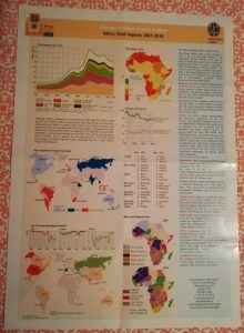
Starting with the food side, all statistics are concerned with African importation of food, the types of food, and their origins. In the top left corner, we are presented with a graph representing imports from 2001 to 2016. Different colours signify different food categories, e.g. cereals and sugars. Up to 2008 there is a steady rise in all categories. A minimal plummet stretches up to 2009, after which a surge can be observed. Imports fall steadily after 2011 with a small upturn between 2013-2014. Since the graph covers the entire continent, it is hard to pinpoint causes for the highs and lows, but we may find an explanations in global and regional events. Firstly, the impact of the 2008 financial crisis may account for the consequent drop, although its effects are limited. Naturally, food remains a necessity even when there is a crisis. This may be truest for those who, in search for economic improvement, have migrated to cities where local food production is low and importation consequently high. One could also speculate that degenerating economies elsewhere pushed (Western) foodstuff exporters towards Africa as destination for their produce. The 2011 drop may be linked to the instabilities surrounding the Arab Spring. This is supported by the neighbouring graphic of food deficits in 2010 which shows major deficits in Northern Africa preceding the regional uprisings. Some researchers have even drawn causal relations between the rising food prices in 2011 and the region’s political instability (see for example Soffiantini, 2020). Both rising food prices and decreased ability to attract exporters, may explain the post-2011 drop in food imports.
We may, then, deduce two stories from the dropping imports; either Africa is producing more locally, reducing import needs, or the price of imports has trumped affordability which may in turn signify decreasing food security. The graph Food and cereal imports shows that indeed the focus on importation of food has fallen over the past decade. If importation has dropped but food requirements have not, then where is the food presently coming from? The bottom graphics sketch an image of a decreasing role in global food exports for classical powers like the USA. Yet, there were still only two African countries among the main exporters in 2016; South Africa and Ethiopia. Interestingly, the sectors for which these countries score high are also those for which African imports have consistently been low (see food imports 2001-2016), namely vegetables and fruits, and beverages, spirits, and vinegar. Thus, intra-African production cannot explain the overall import-drop. Moreover, even if Ethiopia and especially South Africa have increased their production to such an amount that they can provide other African nations, this may increase general food security, but does little for individual countries.
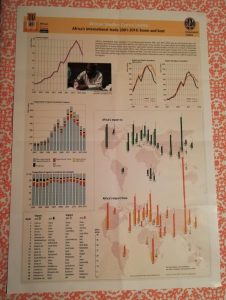
Maybe answers can be found on the flip-side. One thing that immediately stands out is the ubiquity of graphs relative to graphics. Is ‘trade’ more suited to the serious nature of graphs, and ‘food’ to the simpler representation of colourful maps? It raises questions of the attention given to international trade versus the consequences hereof, but that is an ontological debate for a longer blog post. The four top graphs on this side of the poster all depict rising imports and exports from 2001 to 2014. The year 2009 forms an exception, which again may be credited to the global financial crisis. The ASCL presented the trend of ice cream imports as a metaphor for booms and busts in African international trade. Ice cream imports, as status-indicating food item, signal the growth of an ice-cream buying middle-class and of ice-cream selling modernised stores. As such, the graph reflects socio-economic dynamics, making the post-2014 drop worrisome. If the economic growth of Africans is reflected by increased international trade, does the drop in imports and exports signal economic decline?
Perhaps it is not so much decline as stagnation. This may be supported by the bar-graph Composition of exports of products (percentages) which shows a consistent focus on the export of raw materials. Combined with the drop in real value of these exports, as seen in the graph above, this may explain why further economic growth is not stimulated and thus not reflected in trade statistics. Finally, we must also look at the page-wide graphic comparing export and import countries in 2001 and 2016. Most striking here is the tremendous increase in international trade within the past decades and the continuous position of Africa as net-importer. Furthermore, intra-African trade remains limited, with only South Africa serving as both exporter and importer to the continent in 2016.
In conclusion, the two sides of this ASCL poster tell a familiar story: Africa as exporter of raw materials and importer of processed goods, including food. Yet, it also imports unprocessed foods, such as cereals. Why? Is there really such a need for these items among Africans, for example due to rapid urbanisation? Or, as speculated above, has Africa become a dumping ground for transnationals seeking new markets? Do the recent import declines represent growing self-sufficiency or increasing food insecurity? And to doubt everything we might deduce from this poster: If only South Africa is a strong global player, how much do the exceptional experiences of that country influence these continent-wide statistics? The only answers these graphics provide to our previous questions, is more questions.
References
Soffiantini, G. (2020). Food insecurity and political instability during the Arab Spring. Global Food Security, 26, 100400. Doi: https://doi.org/10.1016/j.gfs.2020.100400
Mirjam de Bruijn
October 15, 2020 (07:48)
In fact then is the conclusion that a poster full of graphs does not help to understand? Also if I understand it correctly it is not clear where the figures are from. It then becomes interesting to understand why the ASCL produces such posters? What is the message they want to convey with it?