

My thesis uses a wide variety of forms of research, and so in trying to organize my findings I needed to find links within the different data sets to decide where and how to use the findings, and what would make the most sense for how I displayed the visuals and excerpts from blogs and social media. I chose to work with a mindmap and began with a simple diagram with short phrases that were easier to read, but as I continued to find links between my findings, the diagram became more complex (and difficult to read for anyone other than me).
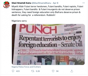
The image shared below is an example of a Tweet that incites violence, has a huge following, and links to a local news organization. After writing a visualization of my data, I decided that I would display a Tweet with a hyperlink to the article. This will allow me to combine different types of findings and illustrate my findings clearly for the reader without having to display full articles. The Tweet is from Nnamdi Okwu Kanu, a British Nigerian Biafra political activist, and leader of the Indigenous People of Biafra (IPOB) who has 270 000 followers on Twitter.
 Visualization of my data.
![]()
![]()
![]()